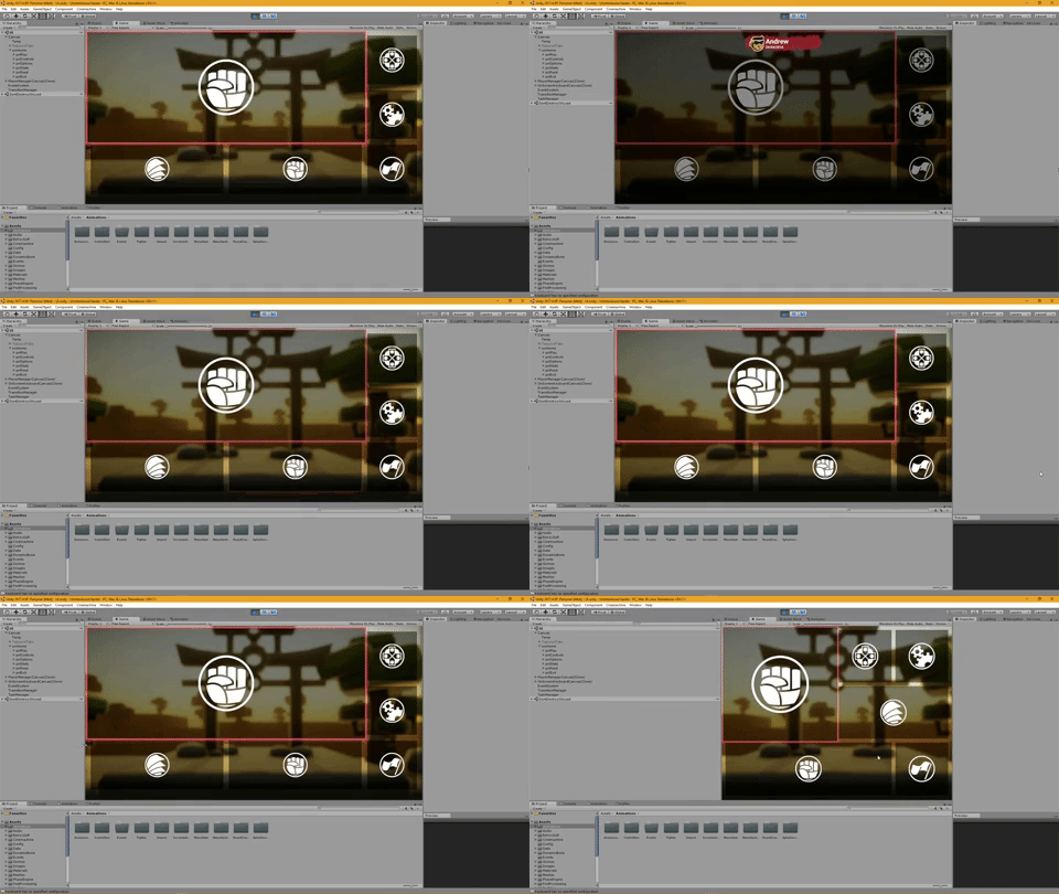
Responsive grid UI system
So, coming from a web site/app development background, I felt at home with a responsive 12 column grid system for designing interfaces. I’ve spent a bit of time now creating one within Unity to work with the built in UI system.
It allows you to define how many columns you want your layout to be based on and what your responsive break points are (which can be based on either a pixel width or aspect ratio, and can also be based on the screen or the particular container) and can also be nested as required. Each section can then be given a number of columns it should fill at each responsive size (with logical fallbacks where you don’t specify all sizes). The system also automatically works out the flow between items so when you want to navigate in a particular direction it can calculate which item you should move (based on relative positioning) to without you having to configure those links.
Plenty of graphical work to do but it seems quite nice to work with so far!
Get Irrational Karate
Irrational Karate
Like karate, but cuter, and without an understanding of the rules.
| Status | In development |
| Author | Never Rest Studio |
| Genre | Fighting |
| Tags | Beat 'em up, Cute, Local multiplayer, Singleplayer |
| Languages | English |
More posts
- Multiplayer on keyboardJul 13, 2018
- Achievements SystemJun 30, 2018
- AI upgradesJun 28, 2018
- Version 0.12.0Jun 20, 2018
- Optimisation & fireballsJun 17, 2018
- Level & character selectionJun 07, 2018
- Animation MirroringMay 30, 2018
- New stage (city)May 28, 2018
- Responsive grid UI system (continued)May 16, 2018


Leave a comment
Log in with itch.io to leave a comment.